Intro
I was thinking about the AP Top 25 poll recently (as one does in early August) and I wondered what it might look like if we visualized the poll results of a given team over the course of multiple years, to create a sort of visual representation of their program’s story arc over time. I decided to go ahead and blow 2 hours of my Sunday on that, and I’m here to share the fruits of my labor.
Setup + Data
We’ll start, as always, by loading up some packages. This time, we only need {cfbfastR} (to get the AP Poll data) and good ’ol {tidyverse} (for dplyr, ggplot2, and all the rest of the usual suspects).
library(cfbfastR) # Great package for getting CFB data
library(tidyverse) # Our old friend
Okay, next we’ll pull some data. Unfortunately, as much as I love the cfbfastR package, the function to pull historical poll data is kinda wack; I’ll get into why in a second. Before that, we’ll grab all the FBS teams’ logo / color / team info, which will be helpful later on when we make charts.
team_data <- cfbfastR::cfbd_team_info() |>
  mutate(
    color = case_when(
      school == "LSU" ~ "#461D7C", # The default yellow for LSU is hard to see
      TRUE ~ color
    )
  )
Now, ideally, the function cfbfastR::cfbd_rankings() would let us pull data for a range of years / weeks at one time. Annoyingly, it doesn’t, and we gotta pull ’em one at a time. I actually don’t think this is any fault of the developers of the cfbfastR package though (I think it’s CFB Database’s API), so it’s all good.
I’m going to pull all the data from 1989 onward, because that’s the first year they started doing 25 teams. I’m also going to try 16 weeks of data for all seasons, even though a lot of them will have fewer. Lastly, I’m not going to bother with postseason rankings because I don’t feel like it. Sue me.
If I weren’t a fraud, I would do this with apply(). Since I only need to pull this once though, I don’t care about economy and I’m just gonna write a “for” loop. Sue me again, I dare you. My lawyers will eat you alive.
years <- seq(from = 1989, to = 2022)
weeks <- seq(from = 1, to = 16)

# Have to get the data one year at a time
ap_data <- tibble()
for(yr in years){
  for(wk in weeks){
    # Try the year / week combo for data
    temp <- cfbfastR::cfbd_rankings(year = yr,
                                       week = wk,
                                       season_type = "regular")

    # If that returned anything...
    if(nrow(temp) > 0 & exists("temp")){
      # Save the AP top 25 and then remove the temp object
      temp <- temp |>
        filter(poll == "AP Top 25")
      ap_data <- rbind(ap_data, temp)
      rm(temp)

      cli::cli_progress_message(paste0("Season ", yr, ", week ", wk, " done!"))
    } else {
      cli::cli_alert_danger(paste0("Season ", yr, ", week ", wk, " not found!"))
    }

  }
}

write_rds(ap_data, "./data/ap_data.rds")
I then saved the resulting ~12,000 rows of data locally, so I wouldn’t have to do that again. Here’s what the data look like:
ap_data <- read_rds("./data/ap_data.rds")

head(ap_data)
## season season_type week poll rank school conference
## 1: 1989 regular 1 AP Top 25 1 Michigan Big Ten
## 2: 1989 regular 1 AP Top 25 2 Notre Dame FBS Independents
## 3: 1989 regular 1 AP Top 25 3 Nebraska Big 8
## 4: 1989 regular 1 AP Top 25 4 Miami FBS Independents
## 5: 1989 regular 1 AP Top 25 5 USC Pac-10
## 6: 1989 regular 1 AP Top 25 6 Florida State FBS Independents
## first_place_votes points
## 1: NA NA
## 2: NA NA
## 3: NA NA
## 4: NA NA
## 5: NA NA
## 6: NA NACleaning + wrangling
Now, this is where it gets hairy. Putting this into graph form requires us to solve a few problems:
- Problem #1, we have to think about the fact that there are missing weeks in here. Some of them were cancelled (like after 9/11), some of them are just missing data in CFB Database, but they’re going to cause problems if we don’t account for that.
- Problem #2, this data doesn’t include dates. So we need a way of actually ordering these poll results sequentially, so we can graph ’em along the x-axis. We’ll have to combine
seasonandweeksomehow to accomplish this. - Problem #3, when we graph this by team, we have to account for the fact that most teams don’t make the top 25 most weeks. In other words, we gotta figure out how to add more rows so that each school / week / year combination has a value, even if that value is “unranked.” Hopefully that made sense; if it doesn’t, it might make more sense when we actually get to the graphs.
We’ll deal with these one at a time. First, let’s start by making a new dataframe with every possible combo of school / week / season in the data. We don’t want to use sequence() here, because we’re specifically trying to get every combo that actually exists in the data, not every possible combo between the start and end.
all_schools <- tibble(school = unique(ap_data$school))
# This combines each possible combo into its own row, solving problem #1
all_seasons_weeks <- ap_data |>
  group_by(season, week) |>
  reframe()
all_weeks_absolute <- cross_join(all_seasons_weeks, all_schools)
Next, we’ll smash this new dataframe into our ap_data, which will make a new version that includes new rows for the missing combinations of school / week / season. These new rows will have NA values for all the AP poll data, indicating the school was unranked that week / season. I actually want those to be 0 instead though, so I’m going to change all the NAs to 0s with mutate(across()).
ap_data_clean <- all_weeks_absolute |>
  # This adds the new rows we need for unranked schools, solving problem #3
  left_join(ap_data) |>
  group_by(season, week) |>
  mutate(
    # This is an absolute ordering of weeks, solving problem #2
    week_absolute = cur_group_id()
  ) |>
    mutate(
    # I want these to be '0' instead of 'NA'
    across(.cols = c("rank", "points", "first_place_votes"),
           .fns = ~if_else(is.na(.x), as.integer(0), .x))
  )
Graphs
Graph 1 – rankings over time
The first graph I decided to make was simply “AP rank over time.” We’ve got our nice week_absolute variable to use on the x-axis, and we’ll just use an inversed value of their ranking on the y-axis (so a rank of #1 would get you 26, a rank of #25 would get you 1, and unranked would get you 0). This shows us the “story arc” of each program – higher is better, lower is worse.
I decided to just graph the top 25 most highly ranked teams, and I also decided to just ax all the data from 2020 because of how messed up it is (lots of teams were present in some weeks but not others, etc. Just a mess).
graph_data <- ap_data_clean |>
  mutate(
    # Inversing rank for graph purposes
    rank_inv = if_else(rank != 0, 26 - rank, 0)
  )

# Need custom labels for the x-axis because it's weird
graph_labels <- graph_data |>
  group_by(season) |>
  summarize(
    min_week = min(week_absolute),
    max_week = max(week_absolute)
  ) |>
  filter(season %% 2 == 0) |>
  mutate(season = paste0("'", substr(season, 3, 4)))

# Want the top 12 of all time
top_12_all_time <- graph_data |>
  group_by(school) |>
  summarize(total_ranks = sum(rank_inv, na.rm = T)) |>
  slice_max(total_ranks, n = 12)

graph_data |>
  filter(season != 2020, # COVID year
         school %in% top_12_all_time$school
  ) |>
  left_join(top_12_all_time, by = "school") |>
  mutate(
    school_w_total = paste0(school, " (",
                            format(total_ranks, big.mark = ",") |> trimws(),
                            " total points)"
    )
  ) |>
  ggplot(aes(x = week_absolute,
             y = rank_inv,
             color = school)) +
  geom_line() +
  geom_hline(yintercept = 1, linetype = "dashed", alpha = 0.8) +
  annotate("rect",
           xmin = 473, xmax = 488,
           ymin = 0, ymax = 25,
           alpha = 0.5) +
  scale_x_continuous(
    labels = graph_labels$season,
    breaks = graph_labels$min_week
  ) +
  scale_y_continuous(breaks = c(1, 6, 11, 16, 21, 26),
                     labels = ~26 - .x) +
  scale_color_manual(breaks = team_data$school,
                     values = team_data$color) +
  facet_wrap(~factor(reorder(school_w_total, -total_ranks), ordered = T),
             ncol = 2,
             scales = "free_x") +
  guides(color = "none") +
  ggthemes::theme_fivethirtyeight() +
  labs(
    title = paste0("AP Top 25 History: Rankings Over Time"),
    subtitle = "AP Poll Rankings, 1989 - present",
    x = "Poll Week",
    y = "Ranking Position",
    caption = "Weeks below the dotted line indicate a team was unranked.
    Due to comparability issues (missing teams, weeks, etc.),
    data from the 2020 season have been removed."
  )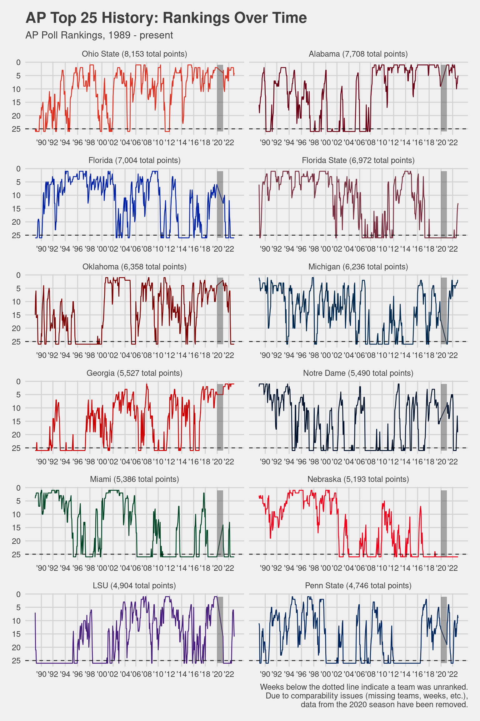
I really like how this came out! My two favorites are Nebraska and Alabama, for how clearly you can see the switch flip due to specific personnel changes. The sustained success of Alabama is insane to see graphed, and it’s interesting to see how closely it mirrors FSU’s dominance in the 90s. And Nebraska is funny because… yowch.
Graph 2 – points over time
This graph is very similar; the difference is that instead of graphing rankings (an ordinal variable), we’re gonna graph the point totals in the poll (a continuous variable). This is nicer for our purposes because it will probably provide a smoother view over time, but the downside is that we only have data on this from 2014 onward. This helpfully coincides with the current realignment era, though, so it’s still worth looking at I think.
top_12_all_time <- ap_data_clean |>
  group_by(school) |>
  summarize(total_points = sum(points, na.rm = T)) |>
  slice_max(total_points, n = 12)

graph_data <- ap_data_clean |>
  filter(
    season >= 2014,
    school %in% top_12_all_time$school
  )

graph_labels <- graph_data |>
  group_by(season = paste0("'", substr(season, 3, 4))) |>
  summarize(
    min_week = min(week_absolute),
    max_week = max(week_absolute)
  )

graph_data |>
  filter(season != 2020) |> # COVID year
  left_join(top_12_all_time, by = "school") |>
  mutate(
    school_w_total = paste0(school, " (",
                            format(total_points, big.mark = ",") |> trimws(),
                            ")"
                            )
  ) |>
  arrange(desc(total_points)) |>
  ggplot(aes(x = week_absolute,
             y = points,
             color = school,
             text = paste0(season, ", wk ", week),
             group = 1
  )) +
  geom_line(linewidth = 1.5) +
  # 2020 removal annotation
  annotate("rect",
           xmin = 473, xmax = 488,
           ymin = 0, ymax = max(graph_data$points),
           alpha = 0.5) +
  # Styling
  guides(color = "none") +
  scale_x_continuous(
    labels = graph_labels$season,
    breaks = graph_labels$min_week
  ) +
  scale_y_continuous(limits = c(0, NA),
                     labels = scales::comma) +
  scale_color_manual(breaks = team_data$school,
                     values = team_data$color) +
  ggthemes::theme_fivethirtyeight() +
  facet_wrap(
    ~factor(reorder(school_w_total, -total_points), ordered = T),
    ncol = 2
  ) +
  labs(
    title = paste0("AP Top 25 History"),
    subtitle = "Total points per poll, 2014 - present",
    x = "Poll Week",
    y = "Total Points Received",
    caption = "Due to comparability issues (missing teams, weeks, etc.),
    data from the 2020 season have been removed."
  )
Alabama sucks so bad. Ugh.
Conclusion
I thought this was a fun way of visualizing the trajectory of the various CFB programs over the years. I could probably do some similar things with the coach’s poll, etc., but I’ll save that for another Sunday afternoon.